Elliot Jay Stocks provides insight into the combination of CSS media queries and CSS transitions. The basic premise is this: you use media queries to design responsive websites that adapt in layout according to browser width, and you constantly resize your browser to see how the website performs, but every time a query kicks in, there’s a harsh jump between the first style and the second. Why not use some simple CSS transitions to smooth the jump by animating the resize? A nice case study.
Responsive Data Tables
Chris Coyier and Scott Jehl are experimenting with responsive design techniques for displaying data tables. By default, data tables can be quite wide, and necessarily so. You could zoom out and see the whole table, but then the text size would be too small to read. You could zoom in to make it readable, but then you’d have to scroll both vertically and horizontally (sad face) to browse the table. One solution is to reformat the table for better readability. Another is to display a pie graph from the data. Yet another is to adapt the table into a mini-graphic for narrow screens (rather than interfering much with the content when the full table is displayed).
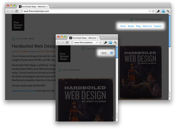
Responsive Navigation Menus: Convert a Menu to a Dropdown for Small Screens
Chris Coyier describes another technique for converting a regular row of links into a dropdown menu when the browser window is narrow. When the user is on a small screen and clicks the dropdown, they’ll get an interface to select an option that is nice and big and easy to choose. Obviously much better than displaying a tiny link.
CSS Media Queries and Using Available Space
A tutorial from CSS-Tricks that discusses how to make subtle changes with media queries and how to use media queries in a single style sheet. For instance, if you have a fluid-width design in which the sidebar is 35% of the width of the page, depending on the width of the browser window, you could say, “If the browser is really narrow, do this. If it’s wider, do this. If it’s really wide, do this.” In the article, you’ll learn how to modify a list of links according to the browser’s viewport.
Responsive Images, Responsive Videos
Fluid Images
Fluid images are a central aspect of a responsive design. This article by Ethan Marcotte gives a thorough overview on creating them using the classic img { max-width: 100%; } code snippet, as well as details to get you started.
Responsive Image: Experimenting With Context-Aware Image Sizing
An alternative approach to fluid images by Filament Group. This technique allows designers to create responsive layouts that serve different image sizes at different resolutions. Effectively, it allows designers to create mobile-optimized images for smaller screens, and then serve higher-resolution versions to larger screens. Filament Group has developed this technique that uses .htaccess files and JavaScript to serve up different sized images based on the screen width. An alternative solution is to use tools like TinySrc which allows you to merely prefix all large images in your source code with a TinySrc URL, and the tool does the rest.
Responsive Images and Context-Aware Image Sizing
Craig Russell has developed a technique that uses a server-side script (in PHP) to serve up images of several different resolutions. The idea is that within the PHP script, a nested array is used that lists image files and their relative percentage scales. In HTML, the image’s src attribute would be set to get the requested image’s id, but with no scale specified. A JavaScript calculates the percentage width of the image relative to the maximum width of the container, and this figure is then appended to the end of the src attribute as the scale parameter. The comments in the article contain some nice ideas and suggestions on how the technique could be improved.
Responsive Images Right Now
Harry Roberts’ idea is to use the img element for the smaller of the two images, the image that you want mobile users to download. You would also have a containing div to which you apply the large version of the image as a background through CSS. You then hide the img from desktop users, and show them the large CSS background, and hide the background image from mobile users and just serve them the smaller inline image.
Responsive Images Using CSS3
Nicolas Gallagher’s method relies on the use of @media queries, CSS3-generated content and the CSS3 extension to the attr() function. By combining the content property with the CSS3 extension to attr(), you are able to specify that an attribute’s value should be interpreted as the URL part of a url() expression. In this case, it means you will be able to replace an image’s content with the image found at the destination URL, stored in a custom HTML data-* attribute.
Responsive Images Using Cookies
Keith Clark suggests using cookies to serve smaller images to mobile users. Whenever a browser requests a file from a server, it automatically forwards any cookie data along with the request. If we use JavaScript to populate a cookie with the current screen’s dimensions, all subsequent requests made by the browser will pass this data to the server. In other words, the server would know the screen size of the device that is asking for the file.
Responsive Images With ExpressionEngine
John Faulds presents a technique for responsive images that is different from the techniques presented above. It involves querying the device’s user agent string to determine whether it is mobile, and then setting a global variable that can then be used in templates to modify the size of the image output. Basically, only one image gets sent to the browser, but that image is different depending on whether you’re viewing the page on a mobile or desktop device.
CSS: Elastic Videos
Nick La applies the max-width: 100%; snippet to videos and presents techniques that make HTML5 videos and object- and iFrame-embedded videos responsive. For the latter, the trick is very simple. Just wrap the embedding code in a div container, and specify a 50% to 60% padding-bottom. Then, specify the child elements (iFrame, object embed) and a 100% width and 100% height, with absolute positioning. This will force the embedded elements to expand full width automatically. Initially discovered by Thierry Koblentz.
Published in Smashing Magazine


